Kason Corporation
Kason's Main Goal
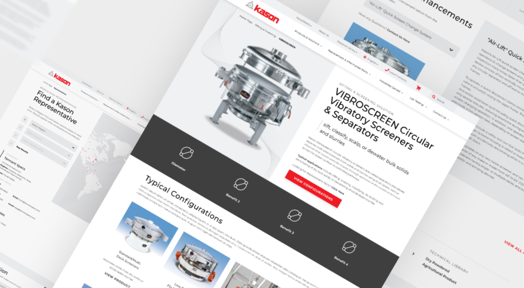
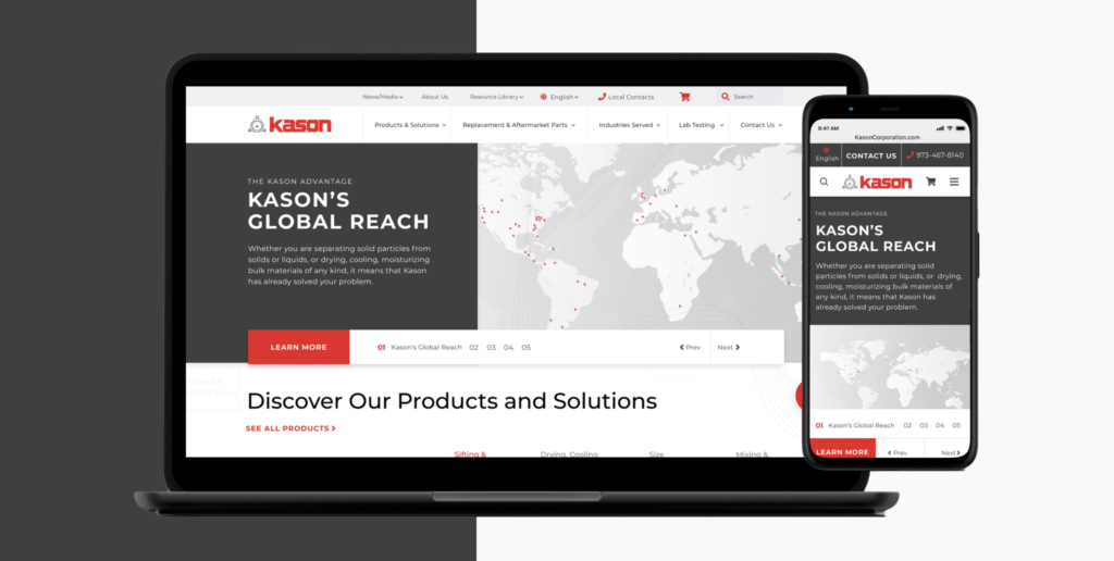
Revamped internal marketing collateral and spearheaded a website redesign for Kason Corporation, a screening and processing equipment supplier, with a primary emphasis on ensuring consistency. The goal for the redesigned site was to increase lead generation and ensure responsiveness across all devices. Additionally, strategically reorganized and visually enhanced the display of Kason's extensive range of products and configurations.
The Challenge At Hand
The Design Process
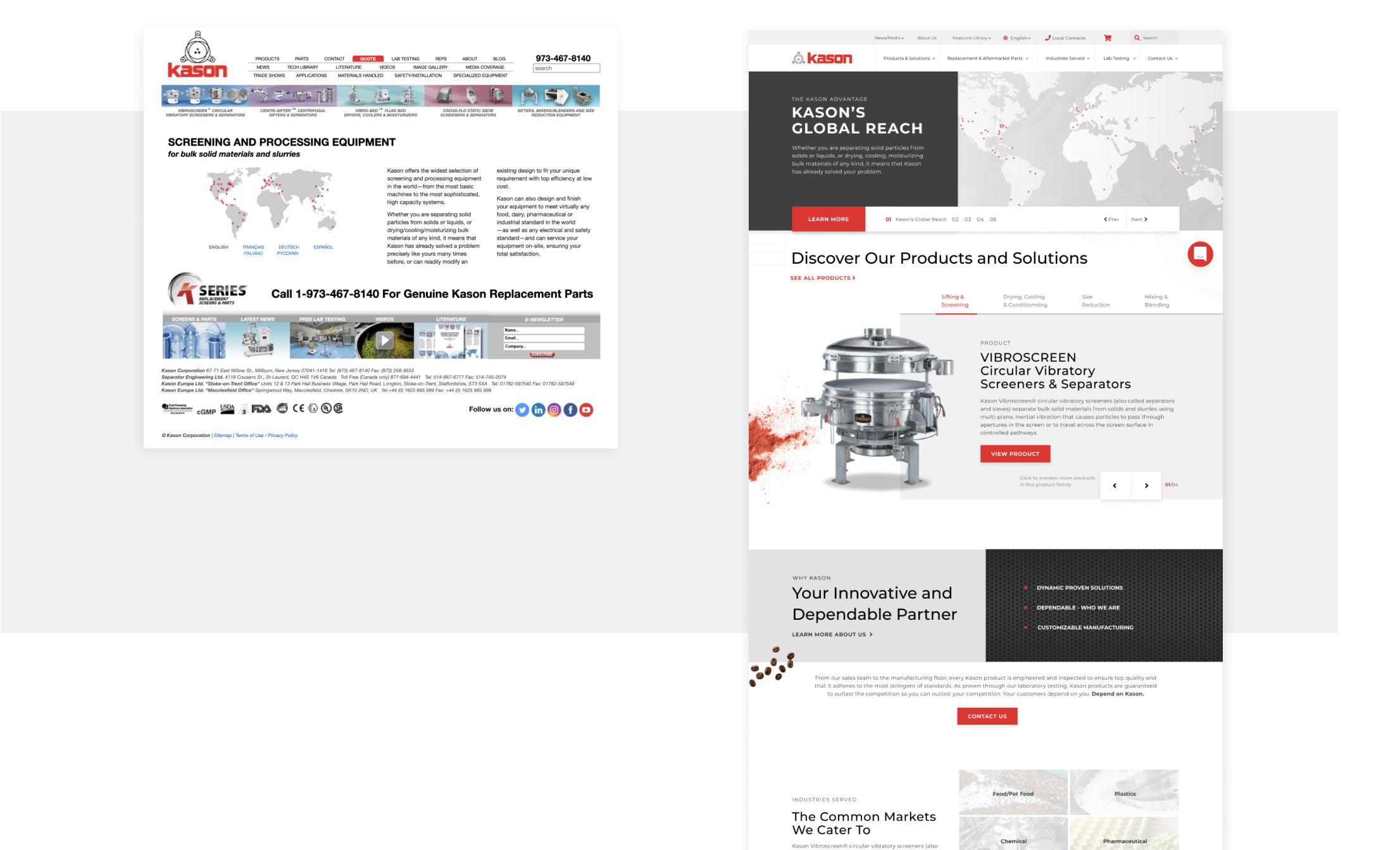
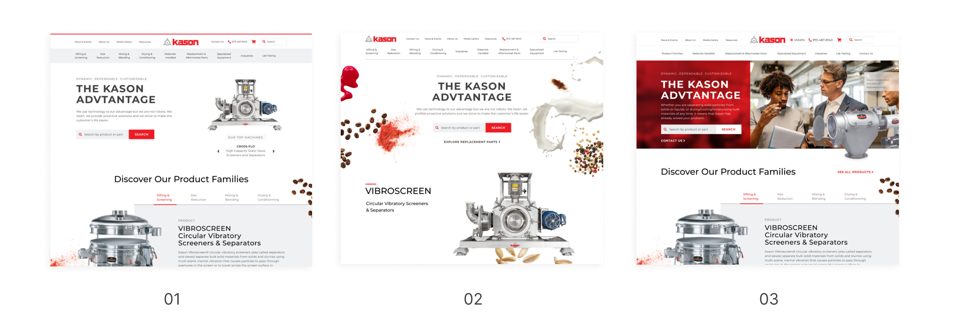
The initial concepts for the homepage featured a global site search within the hero banner, catering to customers who arrive with a clear idea of what they are seeking. Beneath the banner, a tab structure was introduced to showcase products, designed to accommodate methodical customers who prefer thorough interaction with content.
The rotating banner replaced the hero banner search functionality, providing a dynamic space to highlight upcoming events, news, products, and more. While the site search moved to the navigation, it continued to serve its original purpose of facilitating accessible searches. The incorporation of large images and textures aimed to resonate with emotional and spontaneous customers who connect more deeply with product and humanistic images.
Under the new branding guidelines, various textures such as coffee beans, liquids, and nuts were strategically chosen to metaphorically visualize the process of industrial products sifting and screening solids from liquids. The intricate lines and mesh textures were employed to convey the dynamic motion of the different machines in sifting and screening mixtures.
E-Commerce Integration
The inclusion of an E-Commerce element posed an additional design challenge, as the website accommodated both a quote cart and an e-commerce cart. The quote cart enables customers to request quotes for products, while the e-commerce section facilitates confirmed purchases. After iterating through various versions of the checkout process, the decision was made to keep the two transaction methods separate in the final design. This choice aimed to reduce confusion and align with the capabilities of the development framework.
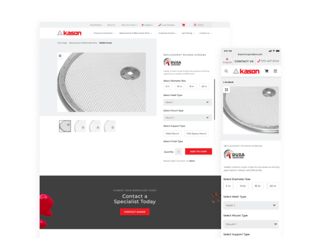
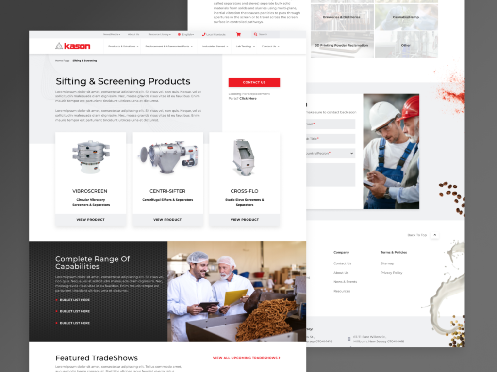
The primary hurdle involved crafting organizational elements for pages housing a vast amount of content, particularly with products featuring numerous configurations and technical specifications that required clear communication. Employing tab structures, responsive tables, collapsible content, and a mega menu, the content was strategically organized. Kason underwent multiple iterations and options for the homepage before settling on the final approved design. Design exploration played a crucial role in the project, ensuring thorough testing of various options to identify the optimal solution. Collaborating with my internal design team and other SEO specialists, I conducted user testing to validate the effectiveness of the design.
Learnings
Designing my first comprehensive e-commerce site provided valuable insights into the distinct development challenges posed by e-commerce and quote carts. While ambitious ideas were considered, not all could be feasibly implemented.
Additionally, this project involved the design of a large number of pages. Maintaining organization on my end was crucial for a smooth handover to the developer, ensuring seamless translation. The site’s launch is anticipated later in 2020, and I eagerly anticipate its growth and increased conversion rates post-launch.
Results and Impact
- In the 90 days following the website launch, they saw an overall 208.77% (176 vs 57) increase in form submissions. With the help of SEO keyword research and having a greater form presence than before, the conversion rate shot up. Also the use of intentionally placing conversion buttons within the content, helped increase form submissions as well based on hotjar data.
- Mobile submissions have increased by 250.00% (14 vs 4) when compared to the previous year. Kason’s previous site was not responsive on mobile or tablet and with the launch of the new responsive site, people found their mobile site easier to navigate.
